|
»Click here to display Table of Contents«
|


Navigation |

|

|

|

|
|
Navigation |
|
|
|

|
|
»Click here to display Table of Contents«
|
Navigation |
|
|
|
|
|
Navigation |
|
|
|
|
|
|
||
The navigation methods to guide users through a form are of the utmost importance and deserve much thought when designing new business processes and the web forms that embody these.
In an ideal world, navigation through a form should be as convenient, intuitive and frictionless as possible. Achieving this is goal will always be a balance between the needs of the business and trying to provide the user as enjoyable an experience as possible.
So here, "Navigation" means more in interactive forms than providing "Previous" and "Next" buttons at the bottom of the page. It means more than providing menus and breadcrumbs. It means more than restricting the user's access to the form's pages to a fixed sequence. It means more than allowing the user to roam through the form at random. It means more than tailoring the form's layout to the range of devices that will be used to access it. It means more than providing menus, be they down the left hand side, along the top or, in a touch environment, brought up by swiping to the side.
Whatever the business function of a form, all forms ultimately must aim at having the user complete them through to submission. If the user abandons the form, that means a lost opportunity. And we can now see how many users access the form and how many of them advance to the submission stage and how many abandon the form (see Analytics).
" Chrome is the visual design elements that give users information about or commands to operate on the screen's content (as opposed to being part of that content). These design elements are provided by the underlying system — whether it be an operating system, a website, or an application — and surround the user's data."
So, chrome informs users with clues about how to use the form. It is also not part of the form's data — the point of creating the form in the first place — and takes up valuable screen real estate. The smaller the screen, the greater the cost of chrome in terms of space.
But having only minimal chrome, adds friction to the form in that the user will have fewer options to do such useful actions as going back several sections to correct some entry.
At least by this we mean that the form does not introduce its own chrome. However, the usual chrome that comes with the operating system and browser combination is present, and this chrome will not be perfect, even in such a mature use case as web browsing.
So, this means the designer is limited a single-page form, and the only way to navigate the form is to scroll the form in the browser's window. While that does not sound so bad at first, it is very limiting and, where there is a lot of information to be entered onto the form, leads to vertical clutter. It also leads to users getting confused if they have to make revisions. In order to find where to make the revision, users have to remember how far up or down they have to scroll to find the fields subject for change, or — even worse, use the browser's "Find" function. Thus, even with this, the simplest navigation scheme, there is friction, especially if the form is long and detailed.
And the designer cannot control how users move through the form. Some form elements, Sections for example, can collapse and expand. Other elements on the form can switch from being invisible to visible. But users can still skip to the end of the form, in anticipation of the "Submit" button being there, only to be disappointed when that button does not work because they have failed to fill in all the mandatory fields, or have entered invalid information somewhere up the form. See Validation for more.
This is slightly more helpful. But users can only step forward and back. This simple chrome uses up the bottom of the page (and may also be duplicated at the top, though many designers resist doing this). This does not amount to much space on the desktop, but in mobile — and especially on narrow smartphones in portrait orientation — that space becomes a large part of the available viewing area. And even more so, when the form is responsive and the two buttons spread out to accommodate the target areas needed for the touch interfaces.
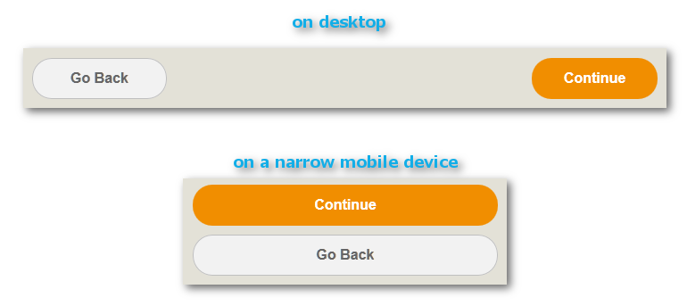
Such a simple concept, though, can suddenly become fraught. The above example has a simple color scheme: orange to move forward and white to go back. But what if users move back and then forget where they have been? Do we indicate whether users have viewed a page through a wider selection of colors? Probably not, because more than two colors have no intrinsic meaning. Users cannot experiment to discover the meanings assigned to colors (such as "already viewed", "yet to be viewed", "not allowed to view", "the last page" and "the first page") except by moving through the pages with the two buttons.
On the desktop, where the viewing area is the largest of any viewing environment. the vertical space occupied by the two buttons is small. But on a narrow mobile device (such as a smartphone in portrait mode), the responsive layout function of the form spreads the buttons out so that their tap area is large enough to be useful and stacks the 2 on top of each other. Both are done to minimize user frustration — a vital consideration in mobile.
Note: in the following examples, all mobile screen shots are either from Preview or in the mobile device's browser, not in the TransactField mobile app.
These are a tried-and-true web design element.
The left hand menu shown above has 3 states (indicated by 3 combinations of text color and background color):
•Current item, here "Loan Information"
•Other items, access allowed
•Other items, access not yet allowed
The color coding scheme becomes obvious to users through their interactions with the menu. It does not need to be spelled out.
In terms of navigation and user experience, the left hand menu is a vast improvement on 2 button navigation:
•Users get clues as to how much more work they have to do before they get to their goal: being able to submit the form.
•They can see what is in store, from the labels of the menu items.
•They get to see where they have been.
•If allowed (see Navigation Choices below), they can skip several pages.
•They can move several pages back in the form, without getting confused or forgetting where they were.
So what are the down sides, given the menu's superiority over the 2 button scheme?
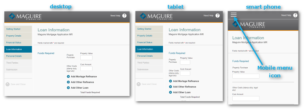
•The space below the left hand menu is dead space. There are a few reasons why this dead space exists, mainly due to past limitations of HTML, and such reasons do not matter much any more. But the convention still exists and some usability gurus advocate it. The dead space is hardly an issue on the desktop. In fact, in the above example, the desktop has another level of deadspace (under the subheading "Funds Required"). The rendering on tablet-sized screens eliminates this second level of whitespace.
•The menu buttons on mobile have to be large enough to prevent user frustration. But this makes the left hand menu unsuitable for very narrow devices such as smartphones in portrait orientation. In the above example, the left hand menu disappears entirely, replaced by a typical mobile piece of chrome: the mobile menu icon, familiarly called "the hamburger icon".
Another variation on the left hand menu chrome:
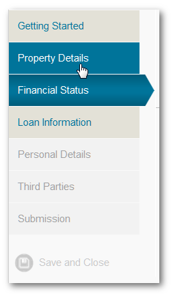
This example has another state added to the 3 already encountered in the previous example: the hover state (as seen in "Property Details" where the user's mouse cursor is hovering over the menu item). Here, "hovering" means that users move their mouse cursor over an object but do not click on their mouse's button to select the object.
The left hand menu can have variants, but most of these have, in the light of experience, led down blind alleys.
•Right-justified captions. Not recommended.
•
•Fly out sub-menus. These have died a quiet death on the web as they demand too much manual dexterity from users.

Top menus are now fashionable and with good reason. They work well on the desktop and with tablets and other wide mobile devices. They also eliminate the dead space of Left Hand menus. This example shows a 5-state top menu: note the differences backgrounds between "Getting Started" (i.e. already visited) and "Loan Information" (available but not yet visited). "Property Details" shows the hover state.
Hover does not exist in a mobile and touch environment. For mobile, hovering is no longer an option.
However, they do not work for narrow mobile devices. And you should keep the captions brief, as the captions begin to wrap for narrower screens. The solution is the same as the above example: the hamburger icon.
Avoka Technologies has given much thought to providing second-level menus to their forms. But we have rejected a large number of the existing solutions,
•Mega Menus, i.e. big 2-dimensional dropdown menus. These worked well on the desktop, but do not work in mobile due to their dependency on hovering (see Top Menus above).
•Flyouts. Again, these are hover-dependent and therefore not an option for mobile.
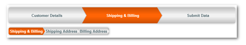
The example above shows our current practise: "Shipping & Billing" has two subdivisions, shown in the chevrons below the main, topmost menu. Our tests show that these work well, both on the desktop and in mobile.
This is the mobile solution to all the above navigation chrome, aside from the 2-button convention. The Mobile Menu Button is also known among developers as "the hamburger" icon.
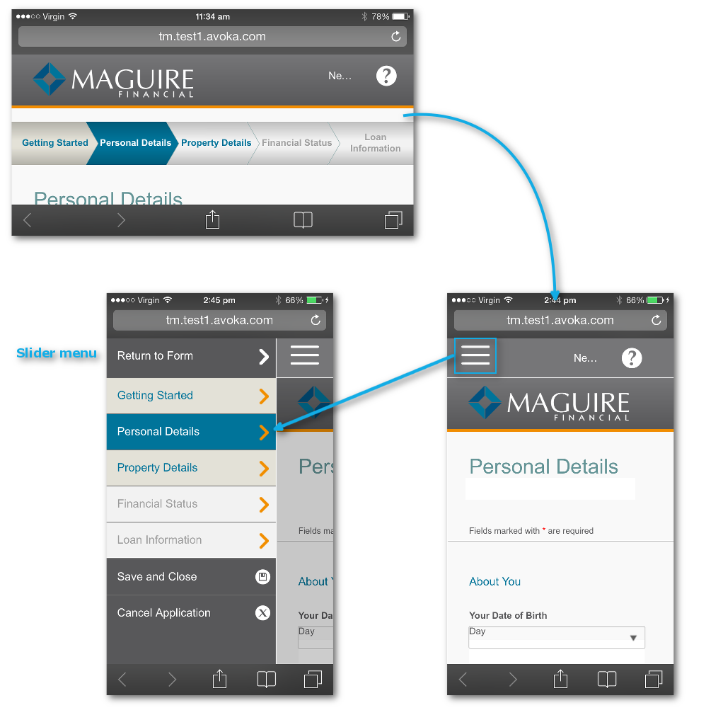
Here on an iPhone 5s, the top menu appears in landscape; the Mobile Menu Button in portrait. Tapping on the Mobile Menu Icon causes the menu to slide out from the left. The menu has only 4 states because it lacks hover.
Chrome is only part of the story. There are several more degrees of freedom to form navigation.
Unconstrained here means that users can select any item on the menu at their merest whim. This certainly removes friction but there is a possible down side: the lack of discipline imposed upon users could be a factor in their abandoning the form.
Constrained here means that users can only make a restricted set of menu choices at any one time in filling-in process. To encourage users to understand what is happening and where they stand in their data entry, the subtle coloring of the menu items is tacitly employed — without any tedious explanation. Users who "get it" will be happy; users who don't will also be happy in that they have not been burdened with the task of ploughing through some ma-rigmarole that is of absolutely no interest to them.
Hiding parts of the form is best done to convenience users, not to conceal aspects of the form because they are "unworthy" for whatever arbitrary reason.
So, you may have already noted that the headers of Sections in Composer forms have much that is hidden: the help text, for example. These hidden passages of the form are there to help users who may be struggling and need some assistance. Confident users do not want to see these, as wading through long, unneeded hand-holding text is off-putting and adds for them friction. But not having help for others will add friction for them.
Another use case of hiding parts of the form as with accordion wizards, where the sections of the form can expand or collapse (instead of being rendered as new pages). However, do bare in mind that users may not fill in some sections due to inattention — for example not realizing that they should expand some section. Applying validation will catch this mistake, but you as a designer forfeit the trust of users for letting them down and leading their navigation through the form astray.
Hiding some parts of the form as a result of users choosing some option or another could also be something that eliminates friction for some users and therefore be a good thing.
There are good reasons for having validation and not allowing users to submit until one or more criteria are met. There are also good reasons why users get fed up with it. Remember: the more users successfully submit a form, the better. In that respect, the web is a popularity contest. The tension between creating friction or gaining the trust of users is not a paradox (a problem to be solved); it is a type of dilemma, where there several options, all correct in themselves, but where you as a designer have to decide what solution to adopt as a judgment call.
Error blocks and validation messages are good to have, but remember the friction they create and that they will win you no popularity.
Abandoned forms are a fact of life in online interactions. We have done our best to give you the tools to achieve reasonable user navigation and hopefully to reduce the percentage of abandoned forms.
To that end, we have introduced to Composer 4 templates capable of detecting where abandonment occurs in the form filling process. This data is then accessed through TM. Note though that there are privacy implications.
Avoka Technologies strongly recommends that forms do not appear embedded in the portal page of your enterprise. One common problem is that the portal itself is not responsive and thus the form contained within it will not display properly on a mobile device. Instead, we recommend that:
•the form take up the whole browser window (similar in effect to the a href tag's parameter target="_parent" in html)
•is not be rendered in a separate window or tab (as seen, for example, with target="_blank")
•so, as a corollary, there should not be breadcrumbs on the form, especially those that lead back to the portal's home landing page.
