

Assistants |

|

|

|

|
|
Assistants |
|
|
|

|
Assistants |
|
|
|
|
|
Assistants |
|
|
|
|
|
|
||
Assistants are located at the top of the Widget Palette and this is the reason they are discussed first. The Field Types in the palette are a mixture of many different types, see Field Types, placing any of them on the form is the same process already covered above. This is also true of Assistants, and they make a good starting point as the resultant fields on the form are so useful, and even rewarding, for the beginner
Assistants are widgets that facilitate the creation of complex structures. Another important set of widgets, that also simplifies complex form structures, is Predefined Blocks.
We will discuss individual widgets in more detail later in this manual. But because Assistants and Predefined Blocks are so powerful, we will now be building examples using these two types. Designing complex forms using individual widgets is more the domain of Composer's power users.
When assistants are first dropped into the form structure, they pop up a wizard to add multiple widgets to the form (radio buttons for example). Each of the Assistants features a table to add a component widget to the group, and Composer will both create the group and maintain the overall structure of the group.

Assistants
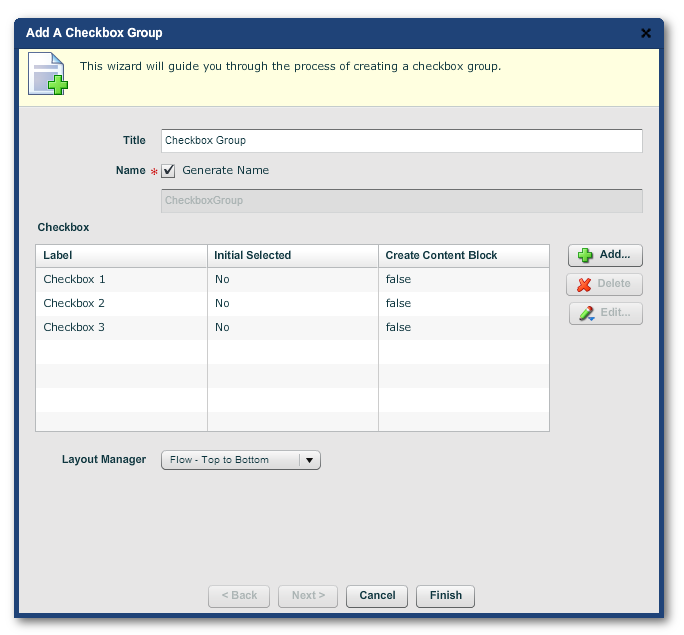
A checkbox is the simplest selector: it can be either checked or unchecked. In a group of checkboxes, more than one can be selected.
The Checkbox assistant will create, in a single operation, a set of checkboxes and their title. If you're creating multiple checkboxes, it's generally a much quicker and easier way to create them than creating individual checkboxes.

The resultant struture
See below for more on the Content Block.
In Composer, the underlying raw value of the checkbox can be set to any string values (see Edit Properties). By default, the values are checked = "true", and unchecked = "false". However, you can set the checked and unchecked values to whatever you want, such as checked = "Y" and unchecked = "N". This can be useful when checkbox values get exported to legacy systems that do not suppport Boolean values ("true" or "false").
Layout Managers get their own topic below.
See below for an explanation of the Content Block.
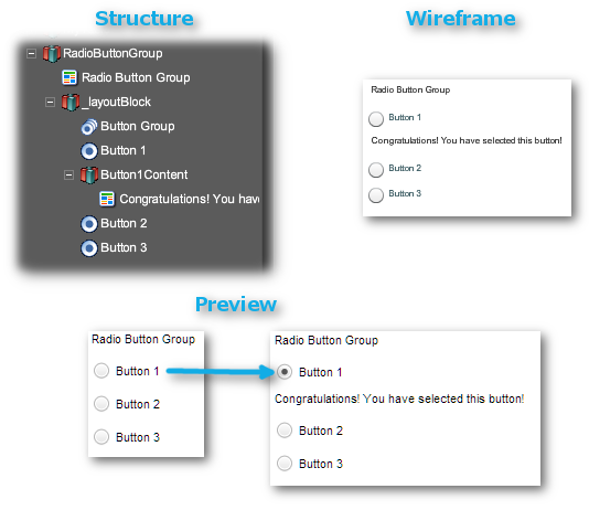
Radio buttons are similar to checkboxes, except that only one of them can be selected from a group.
For example, if we add a Radio Button Assistant to the form, the resulting popup wizard dialog looks as follows:

The "Add a Radio Button Group" wizard dialog
The "Bound Value" for a radio button is the value returned by the form when that button is selected. In the example above, the "Bound Value" is the same as the "Label"; you can change this to return a more convenient value, "1" instead of "Button 1" for example.
If you want to reference the value of the button group (i.e. which button was selected), point to the Button Group widget.
If you check "Make Button Group Mandatory", users must click on one of the radio buttons. Otherwise they will be prompted to do so. See Validation.
The "Initially Selected Radio Button" dropdown is for specifying which of the radio buttons is selected by default when the form is first loaded. Buttons need not be selected by default (though many useability experts advise against this). But once any of the buttons has been clicked on, the group cannot be returned to the unselected state. This is a property of HTML.
Layout Managers have their own topic here.
Filling in the wizard creates the following structure in the form:

The structure the "Radio Button Assistant" adds to the form
The buttons now render on the form (as seen in Preview) as graphics with a more contemporary look than the standard desktop browser widgets.
Note: the button group now appears in the structure below the buttons. This done to allow the inline validation message to appear correctly on the form.
Dynamic Data means that the form's display can change before submission, without the form having to be reloaded. A common use case for dynamic data is to have suggestions appear to assist the user to supply data, an address for example.
Using the assistant is more or less a matter of filling out the wizard, but such a sophisticated concept is best deal with under its own topic.
Manually dropping the three levels of Section widgets onto a form is not difficult, but you should avail yourself of the convenience of panning all the sections of a form in the one wizard.

The Section Assistant wizard
The wizard is easy enough to use, but Sections now have greater significance than just bold headings on the form: they now control the user's very navigation through the form, and the mobile slider menu in responsive layout.
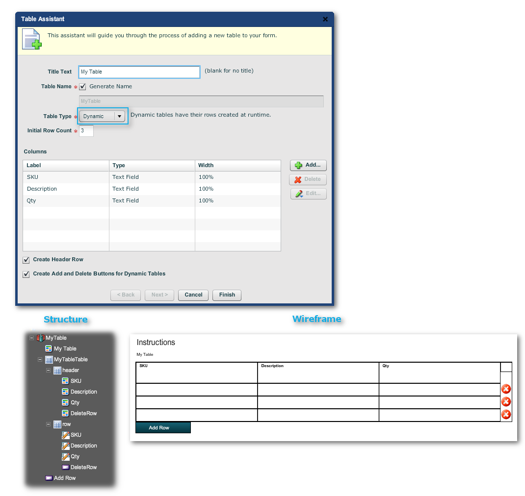
In forms, tables are often dynamic structures where rows can be added or deleted by the end user; they are not, therefore, simple static HTML tables. In Composer 4, you can use the assistant to create either static or dynamic tables.
The following applies to the older style of forms.
As you add each element to the group through the "Add..." button in the wizard, the resulting dialog gives you the option of creating a content block for the element. You can drop widgets into this block, the Plain Text object for example. The block is normally invisible, unless that group element is activated, such as on the selection of the checkbox.
You can reverse this behavior by going to the Edit Properties dialog, "Rules -> Visibility Rule -> Edit" and changing the script from
return {Button1};
to
return !{Button1};
You can also manipulate other behaviors by editing widgets in the group, but take care: you do not want to break the structure.
Note: in Maguire template forms, content blocks now appear at the bottom of button groups, not between buttons.
