

Responsive Layout |

|

|

|

|
|
Responsive Layout |
|
|
|

|
Responsive Layout |
|
|
|
|
|
Responsive Layout |
|
|
|
|
|
|
||
Note: Internet Explorer 8 does not support responsive behavior because IE 8 does not support modern CSS frameworks. Responsive Design as a practice only began in 2010.
Responsive Web Design is a technique for web pages to render properly both on the desktop and mobile devices. A responsive page can be served to desktop browsers or to mobile device browsers, such as smart phones or tablets, and will render optimally on all of them without the need to detect ("sniff") on what device the form is being rendered, nor the need to serve different versions of the page.
It follows that all forms should now incorporate responsive elements and you should now assume that many users will be accessing all forms from mobile devices.
As we have already said, there are 2 modes of delivery to mobile.
The responsive behavior of a form is controlled by the template associated with the page. There are a number of settings in Nuts & Bolts under "Nuts & Bolts -> Responsive Rules" and these are tuned to the Maguire-style of template.
The Maguire Responsive Behavior depends on 3 thresholds values of the width of the device measured in "px".
This no longer means a number of physical pixels on the device's screen, because many modern devices now have higher resolutions than the monitors of the previous century, yet the expectation is that pages should display the same way as they did before. Also there are devices that have high resolution models, "Retina displays" and the like. Again, the expectation is that objects should be rendered the same size on these different device models. Objects cannot be rendered smaller on the higher resolution models because of the touch-based interaction with the user: smaller objects frustrate users as they attempt to accurately hit touch targets.
So the portrait mode width of an iPad (for both Retina and standard resolution models) has been standardized as 768 px and an iPhone as 400 px.
An Operator in a Ruleset determines when the responsive rule set kicks in. The determining factor is the width of the device's browser, measured in "px" (also called "css px" in other documentation), which no longer means a number of physical pixels on the device's screen, because a number of modern devices now have higher resolutions than the monitors of the previous century, yet the expectation is that pages should display the same way as they did before. Also there are devices that have high resolution models, "Retina displays" and the like. Again, the expectation is that objects should be rendered the same size on these different device models. Objects cannot be rendered smaller on the higher resolution models because of the touch-based interaction with the user: smaller objects present difficulties for the fingers of users to accurately hit touch targets.
So, the value of the width of any device in px is the value that the device itself reports back to the engine handling CSS rendering in its browser and in apps running on the device.
So, here, for comparison, are the widths that apply to Apple mobile devices:
Device |
Portrait width in px |
Landscape width in px |
|---|---|---|
iPhone 4, 4s |
320 |
480 |
iPhone 5, 5c, 5s, late model iPod Touches |
320 |
568 |
iPads (both Retina and non-retina displays) |
768 |
1024 |
To manage the complex sets of responsive behaviors shown in Navigation above, Composer 4 and the Maguire-style of template have 3 levels of thresholds, set in "Form Options -> Generation Options -> Edit Properties -> Properties -> HTML Generation" in the Responsive panel. The default values are:
Threshold Level |
Triggering width (in px) |
|---|---|
1 |
768 |
2 |
560 |
3 |
400 |
This explained in Renditions. The default setting for Composer is to have only 2 preview settings, "HTML [Responsive]" and "PDF". If you want, you can separate out the HTML preview modes into Desktop and Responsive through "Form Options -> Generation Options -> Edit Properties -> Properties -> HTML Generation -> Responsive -> Responsive Mode [HTML]". There is really no need to do this in Composer 4; better adjust the width of the browser windowing displaying the HTML Preview and watch the effects as you move through the thresholds.
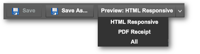
To test responsive behavior, select HTML preview in the dropdown menu, top left of the Form Designer:
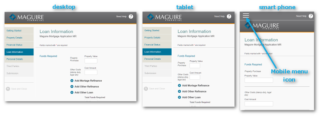
The preview will usually show in a new tab on your browser. To test responsive behavior, pull the tab out of its containing browser window, and make the new window re-sizable (done using the window control icons on the top right of the window in Microsoft Windows, or the top left candy-colored icons in OS X). As you narrow the window, you pass through the thresholds and doing so triggers the next stage of responsive layout where the layout of the form changes accordingly. The changes are quite dramatic:
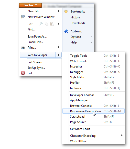
Hint: Firefox has a convenient feature for viewing responsive behaviors. Other browsers do not have such a ready-made facility. You access it
•in Windows from the orange dropdown menu on the top left of the browser window.
•in OS X from "Tools -> Web Developer -> Responsive Design View" in the top menu.
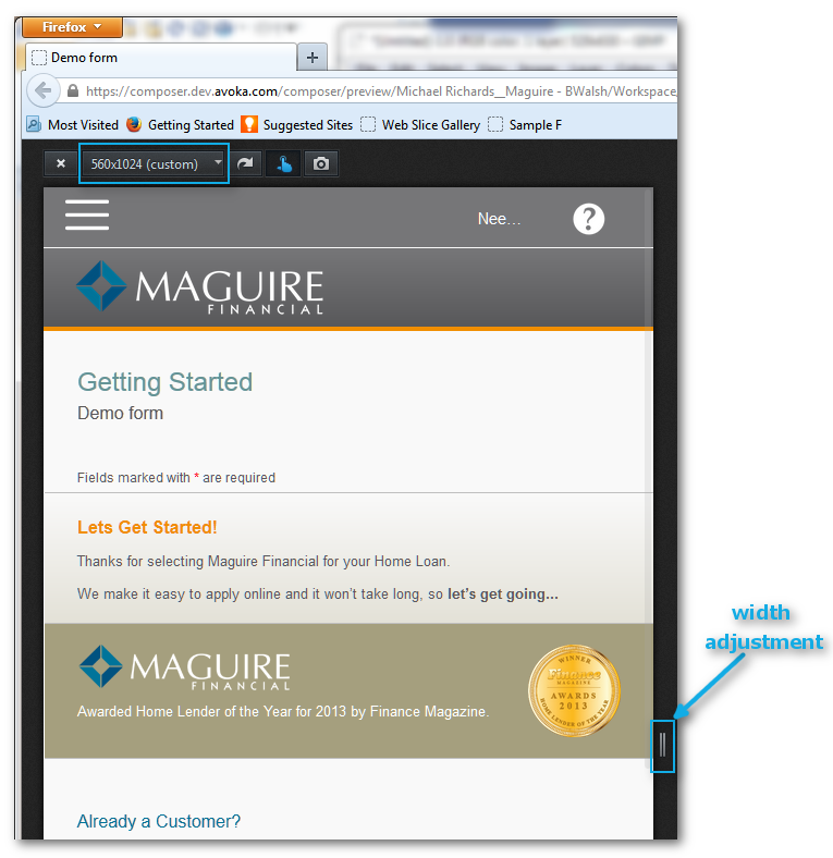
This results in a read-out of the width of the rendered page:
Many grid layouts do work in Responsive forms, but not all.
•Grids with more than 4 columns may look unsatisfactory above threshold 3. You must preview your form above and below the various threshold widths.
•All grid layouts are fine below threshold 3.
•Adjust the "Size" settings or the number of columns in the grid for a workable solution.
In Composer 4, the Nuts & Bolts Responsive Rules (which, unlike previous versions of Composer, now depend on the threshold levels) are now read only. You cannot alter the Responsive Rules in the Structure Panel.
You can, though, point various elements in your form to whichever of these rules is appropriate for that form element (through the "Edit Properties -> Rules -> Responsive -> Responsive Ruleset [HTML]" dropdown menu).
Wrap
The "wrap" action takes inline fields and, when responsive behavior kicks in, places each of these on separate lines.
Wrap and fill
Inline fields are placed on separate lines and all fields stretch across the width of the display.
Note: tables must be set to "wrap and fill" or they will not lay out properly in the narrower thresholds.
Fill
The "fill" action should only be used in Wizards with left-hand menus. For the effect, see the iPad rendering of the example Wizard above. Otherwise, the "fill" action only has meaning for responsive behavior for objects that require special scripting.
Hide
Some elements should not be shown on mobile devices as their presence is inappropriate for the layout on that device.
Hide (no media support)
Some elements should not be shown on mobile devices, due to their fixed space requirements or their relevancy.
Show
The opposite of "hide". In other words, the visibility of the form objects allocated to the show responsive rulesets is determined by the device's position among the 3 thresholds.
See Validation. "In-line validation" means that users receive messages as they proceed filling out the form, rather than receiving a message when they reach the end of the page or form. In-line validation is of the utmost importance on mobile devices, as they reduce user friction if their entry in a field does not pass validation. The last thing they would want is to be told at the end of filling in a multipage form that they have to reverse back through the form, especially in a touch environment where doing so can be difficult and frustrating.
Touch interfaces have a few differences with the desktop mouse-dependent user environment. In touch there is no concept for hovering over an object or text. Instead, users can hold their fingers over some text or object, and other functions of the user interface come into play, such as the "magnifying glass" cursor control for moving through text, or activating the copy and paste controls. Tool tips have no meaning at all in the touch-driven world of mobile. You must therefore not rely on tool tips to guide users through the filling process.
