

Field Layout Control |

|

|

|

|
|
Field Layout Control |
|
|
|

|
Field Layout Control |
|
|
|
|
|
Field Layout Control |
|
|
|
|
|
|
||
This topic covers the mechanics of layout. See here, for a discussion on the aesthetics and design of form layout from. Also see another discussion on Useability and Accessibility.
When designers build a form using simple tools, they tend to drag a widget into a specific position on the form — known as absolute or x-y positioning — then re-position and re-size it using their mouse. This works for simple forms only, not when dealing with multiple device types, nor with maintaining existing forms. Explicit positioning:
•Cannot ensure that forms flow correctly on different technologies, for example on the desktop, tablets or smartphones.
•Cannot ensure all fields have the same styling and sizing.
•Cannot ensure that all fields line up nicely.
•Cannot ensure proper placement on the high resolution devices. Doing this manually is very time consuming and the results are inconsistent.
•Cannot save designers from filling in parameters manually into dialogs. For example, "all standard text fields are 1.5in wide, a caption of 1.2in, and placed 0.7in in from the left margin". The designer then needs to know these magic numbers, and apply them consistently and enter them for every single field on the form.
•Makes a big job out of inserting a new field vertically between two existing fields.
•Cannot automate changing all the fields on the form to have, for example, all the field captions left or top-aligned, or changing all the fonts or background colors.
•Cannot automate changing the width of the form, or its margins and so forth. Instead, every field has to be repositioned.
For these reasons, Composer automates the detailed layout of fields. All you do is specify the order of the fields and, optionally, a few extra "hints" and let Composer do the rest.
Hints may be such things as:
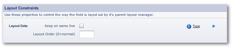
•Keep this field on the same line as the previous one
•Make this field as wide as possible (within the bounds of the space that it has available on the page)
•Spread these two fields across the page, in the ratio 40% to 60%.
•Lay out these 12 fields equally spaced in a 4 column grid
The default settings for the Composer layout managers are set in the template for the form. The following documents how to tweak the layout of elements on the form when the default positioning of an element needs it.
You make layout adjustment through 3 panels in Edit Properties. They are:
•The Layout Manager panel
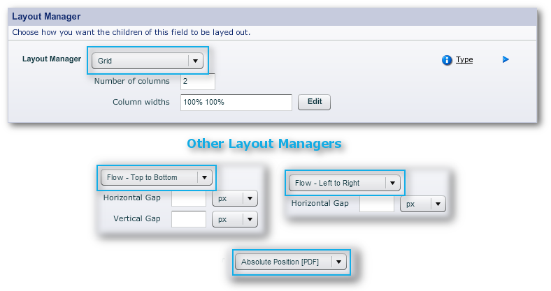
•Layout Constraints
•Sizing
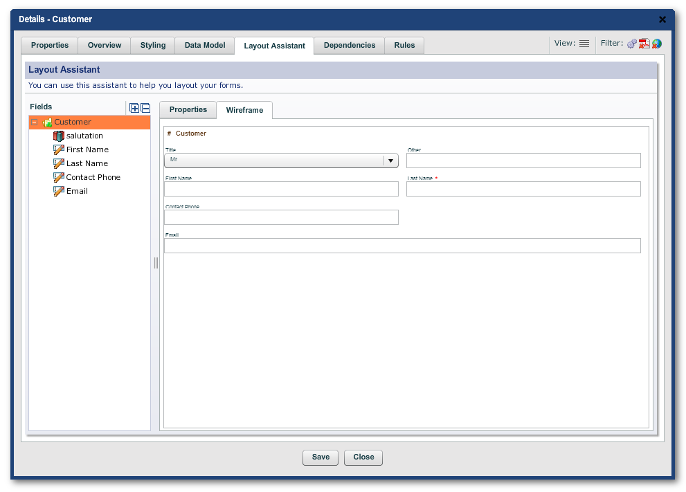
You access these panels in "Edit Properties" through "Properties -> Layout" or in the "Layout Assistant" tab. (That tab, though, does not contain the "Sizing" panel.)
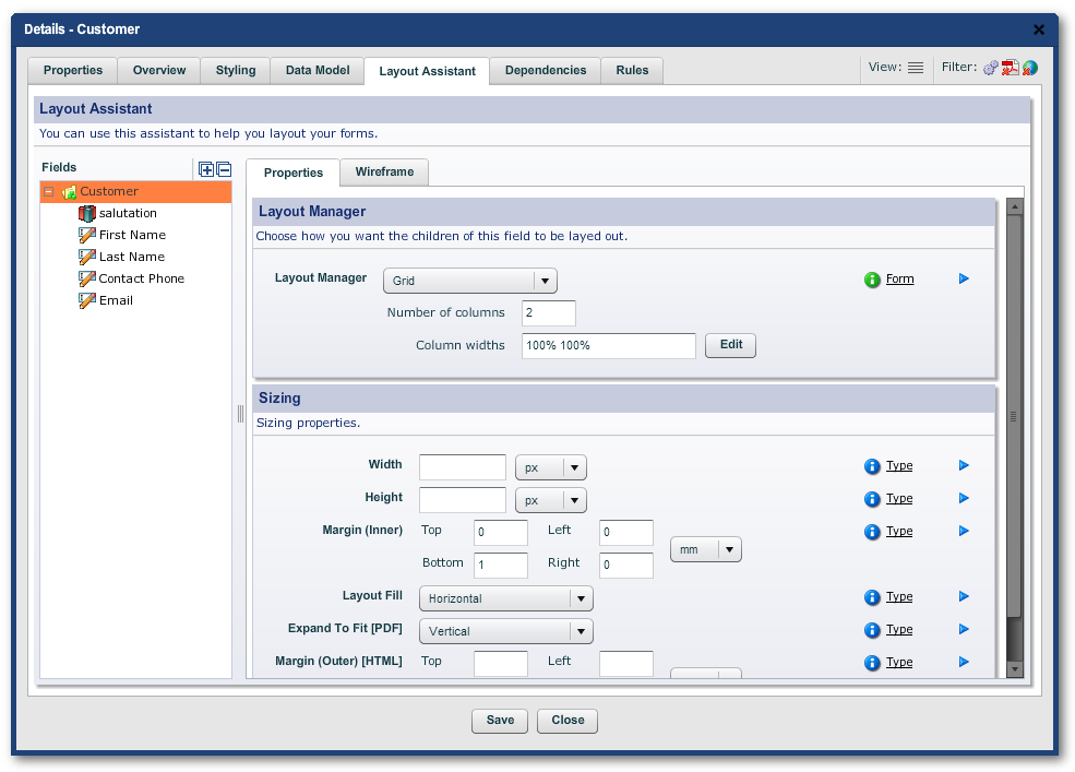
Note the mini Structure Panel (marked "Fields") in the LH Menu of the tab. And, there is also a mini wireframe available on the RH side of the tab in which you can test the effect of tweaking the values in the "Layout Manager" and "Sizing" panels.
A lot of forms are very simple - they just contain a series of fields going down the page. This is also the best layout for the narrower screens on mobile devices.
To achieved this type of layout, you can use the Top to Bottom flow. Fields in a Vertical Flow simply go below each other down the page. The Vertical Flow is always the default manager on all sections and blocks.
There are a few options or "layout hints" that you can specify with the Vertical Flow layout manager to achieve higher levels of usability. These include:
Property |
Description |
|---|---|
Keep on Same Line |
If "Keep on Same Line" is checked, this field will be kept on the same line as the previous field. You can set this on as many fields as will fit on the line. This technique is mostly used to group related field together, such as First Name and Family Name, or State and Zip Code. |
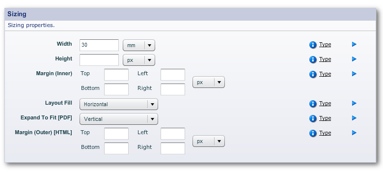
Layout Fill |
If Layout Fill is set to "Horizontal", then this particular field will expand to fit all the available space on the line. This can be used to give your users as much space as possible to fill out longer fields, without having to give your fields explicit widths. If you have multiple fields on the same line with Layout Fill set as "Horizontal", each of them will then share the extra available space equally. |
The Top to Bottom flow does not change the width of any of your fields (unless you select Layout Fill). Your field width will be:
•The "natural" width of the field as defined in your organization stylesheet; or
•The style-set that you associated with this field when you dragged it into the form. Typical style-sets include widths like "Tiny", "Small", "Medium" and "Large", but this will vary depending on how your organization's stylesheets have been set up. If you want to change the style set after you've created the field, you can change it in "Styling -> Stylesets -> Field Size".
•If you select Layout Fill, the layout manager will try to use as much of the line's space as possible and take into account the size of the screen or page, margins, borders and gutter areas, space allocated to menus, and the other fields on the same line.
Note: If you specify too many fields on the same line, this can create layout problems, particularly on smaller screens. The behavior of a line with too many fields will depend on the Responsive Layout rules.
The Top to Bottom Flow is suitable for many simple types of forms; you often need, however, more fine-grained control over how fields spread out across the page. This is where the Left to Right Flow layout manager, comes in.
Horizontal Layout allows you to lay out several fields across the page with very fine-grained control over the size of each field by specifying the percent width of each field.
Note: While we generally talk about percentages, those percentages need not to add up to 100: Composer will adjust accordingly.
The beauty of using percentages is: should you need to add another field onto the same line, move a field, re-size a field, or switch from portrait to landscape, all the other fields will automatically adjust to accommodate the changes. Form maintenance then becomes easy. The fields will also retain their proportions on the range of mobile devices.
Left to Right Flows are always used in conjunction with Top to Bottom. The Top to Bottom controls each line of fields; and Left to Right within each line.
The simplest way to get multiple fields on the same line is to use a Top to Bottom Flow and the "Keep on Same Line" property ("Properties -> Layout -> Layout Constraints"). This, however, gives you little control over the sizing of the fields.
For more control, use a Left to Right flow inside a Top to Bottom to finely control the widths of each of the fields in the single line. Using even multiples of a base size will result in fields on subsequent lines being lined up to each other. This is shown in the screenshot below.

Horizontal Layout

Horizontal Layout in the Hierarchy
You can create a two column layout by using two blocks laid out within a horizontal flow layout, with fields inside them laid out horizontally.
This is shown in the screen-shot below:

Two Column Layout

Two Column Layout in the Hierarchy
Note: You can use the Margin property to provide extra spacing between the two columns, or use another smaller block between the two.
Often, you have to lay out a large number of fields and, for an elegant layout, all these have to align correctly. The Grid layout manager, which is specified on blocks or sections, can achieve this.
By default, each column in the grid has equal size, but you can also specify the width of each column by defining a percentage of the space available, or a fixed size in mm or inches. For example, in a 3 column grid, you may specify the column widths as "100% 60mm 100%". As in the example, these percentages need not add up to 100.

Grid layout with 3 radio buttons respectively 100%, 60mm and 100%

Grid layout with 4 columns each one set to 100%

Grid layout having a text field set to 150% and each checkbox set to 100%
Grids can also be used as part of a hybrid layout. For example, a grid could contain one or more blocks which in turn could contain widgets, or grids could be arranged within a vertical or horizontal flow layout.
Each of the objects added inside the grid can specify hints that provide additional control over how they are laid out.
•Go to next line
•Span

Property editor for the parent block
In the example below, I begin by using as I have 5 checkboxes.
Because 'More than once a week' is such as long caption, I select the 'Force a row break after' that checkbox and make it "span 2 columns".

Tweaking the element with "Edit Properties -> Layout -> Layout Data"
Result:

Grid layout where 3rd column spans 2 columns and the 4th column is forced onto the next line
Tip: Grid layout is particularly useful for laying out multiple checkboxes and radio buttons. Even if your radio buttons all appear on one line, it's still advisable to place them in a grid layout. Decide on a standard grid size for all radio buttons, and always use that grid size for all radio button groups, regardless of how many radio buttons you have. If you do this, all your radio buttons in your entire form will all line up nicely.
Tip: If you have a radio button with a longer than usual caption, simply set the span to 2 so that it uses up two grid cells.
")
Grid layout where each of 5 columns set to 100% (Note: the caption on the 4th column)

Property editor for 'More than 2 times a month'

Grid layout where 4th column spans 2 columns to prevent caption wrapping
There are a few special objects in Composer that deal specifically with laying forms out.
Description |
|
|---|---|
Filler |
A filler is a simple invisible object that simply takes up space, creating "white-space" in your form. White-space is generally considered a good thing by form designers, since it creates visual separation and grouping between objects, and makes a form easier to read and complete. You can use a filler to separate two other objects either vertically or horizontally. For example, you can put a filler after a heading to create some space between the heading and the first field. Fillers can sometimes be useful, but they are difficult to style - if you want to be able to control the look and feel of your form by changing the stylesheets, you're generally better off using properties on the individual objects that can be more easily styled, such as margins. |
Spring |
A spring is exactly what it sounds — it's an object that tries to expand as big as it can. For example, if you want a layout with one field on the left of the page, and another field on the right of the page, simply use two fields in a horizontal layout and place a spring between them. Under the covers, a spring is really just a simple invisible object with its width set to 100%. Springs only work with other objects on a single line. |
Page Break |
Page Breaks only apply to page-oriented formats such as PDF. By default, Composer builds forms that just flow down the page. Fields will automatically "roll over" to the next page when there is not enough room on the current page. Usually, this works fine, but occasionally, you may want to explicitly start on a new page. In order to do this, simply drag a Page Break object into the tree, and your form will immediately skip to the next page. |
There are three other properties in Composer that affect page breaks in PDF forms, in the "Properties -> Pagination -> Pagination Control" panel:
Property |
Description |
|---|---|
Allow Page Breaks |
Containers such as blocks and sections allow you to specify whether they should allow page breaks within themselves or not. If you turn "Allow Page Breaks" off, then the entire section will always stay on the same page - if even one field of the section would flow over to the next page, the entire section will be moved to the following page. If you turn "Allow Page Breaks" on, then if one of the fields in the section exceeds the current page, just that field and the ones that follow it will move to the next page.
Most stylesheets have Allow Page Breaks turned on for two reasons. Firstly, disallowing page breaks can create large blocks of white space at the end of pages, confusing the user. Secondly, in dynamic forms (forms that grow and shrink), making a very simple change on one page could cause a following section to exceed the current page, and when the entire section is moved to the next page, it will seem to "disappear". Users find this very confusing. You should also be very careful to ensure that any section that disallows page breaks is no bigger than a single page, otherwise Reader will not know how to lay it out. |
Force Page Break |
This property is associated with a block, and will force this section or block to start on a new page. This is equivalent to inserting an explicit Page Break object into your form. |
Block Keep With Policy |
Choice between: "None", "Previous" or "Next". In other words, do you want to keep this block on the same PDF with the next block or the previous block, or or you don't care either way. |
