

Legacy Layouts |

|

|

|

|
|
Legacy Layouts |
|
|
|

|
Legacy Layouts |
|
|
|
|
|
Legacy Layouts |
|
|
|
|
|
|
||
There are several different factors to consider when laying out a form. We encourage you to think carefully about your goals, rather than trying to lay out a form to match an existing paper form.
Goal |
Suggestions |
|---|---|
Correct form layout on multiple devices, with differing widths and screen real estate, or switching from portrait to landscape mode. |
•Keep your layout as simple as possible. •Avoid fixed width fields •Use vertical layout managers. •Use Layout-Fill. •Avoid fixed width fields. |
Useability, as much as possible, with grouping of related fields together. |
•Use vertical layout managers, with keep-on-same-line to keep related fields on the same line. •For more control, use horizontal layout managers for each line, within an overall vertical layout. |
Both PDF and HTML. |
•In general, design first for HTML, and then preview in PDF and adjust as necessary. |
Fitting the form onto a single page (no matter how big the form is). |
•Composer is not designed to make use of every bit of whitespace. •Usability studies show that whitespace in a form greatly improves readablity and usability. •Disable all interactive features, including hide/show logic. Expand multi-line text fields, section help, expandable tables and repeats. •There is no cost for an electronic forms to have multiple pages. In fact, multiple pages save money by increasing usability. •If a form is ultimately going to press, consider having two different form designs: one optimized for interactivity, the other for receipt or print. |
Mimicking an existing paper form. |
•Use horizontal layouts, grid layouts, and fixed width fields as necessary. •Use caption left where necessary. •Make the desktop HTML a fixed page width. (This is the default for desktop HTML.) •Don't try to make your form identical to the paper form. Remember, you want a better user experience for your users, and that means having design changes. |
Replicating an existing paper form as a "pixel perfect" copy. |
•You cannot create pixel-perfect copies of existing forms with Composer. •If you require pixel-perfect forms, you should consider creating a separate receipt form. o
Note: Transaction Manager can be configured to support a separate form for the receipt and for the interactive form. |
Keep your layout as simple as possible. More complex layouts become extremely challenging. Keep it simple, unless you have very specific requirements.
Composer's Layout Managers do the fields alignment and uniform sizing, based on your organizational template and style-sheets. Better to let Composer do the work, rather than struggling with Composer for the sake of a particular look.
You don't know how big your user's screen will be. Try not to make too many assumptions about widths, and let Composer do the work of layout out your form.
You can use Advanced mode in the property editor to explicitly set field widths in pixels, mm, or inches, known as "magic numbers". Sometimes this may be necessary, but this introduces two problems:
•Every form designer needs to remember these "magic numbers" to achieve consistency.
•If you need to change some aspect of the layout, you need to modify each field independently.
Composer allows you to define standard fixed width field sizes such as Small, Medium and Large in your stylesheets (see Field Styling). The advantage of these named sizes is that there is nothing to remember, and if you need to change them, you can simply adjust the style-sheet. A good rule of thumb is that these sizes should all be multiples of each other so that combinations of smaller and larger fields all line up.
It can be very useful to use a Grid Layout for groups of checkboxes and radio buttons. Use the same number of grid cells for every set of radio buttons or checkboxes on your form, so that they all line up correctly. Use spans for captions that are very long. We recommend 4 to simplify responsive layout, although this is your preference. Please see the Grid Layout topic on this for details.
Please note that the grid layout is not ideal if you want your form to lay out correctly on narrow screens like smartphones.
Sometimes it is necessary to put units or other tips on a form. For example "miles" for a measurement of distance, or "MM/DD/YY" as a tip for the format for a date field. You can use a Plain Text or Rich Text field for this purpose, but often its difficult to get the text to line up correctly with the field itself, particularly with Caption Top fields.
Composer has a special Label Field that always ensures that the label is aligned with the Text Field that can be used for this purpose.
We generally recommend Caption Top, for a number of reasons. This is summarized here: http://www.avoka.com/composerblog/2011/10/form-design-tip-caption-top/
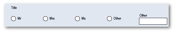
If you mix Text Fields with Radio Buttons or Checkboxes on the same line, you often get results where the resulting layout looks bad. This is because Radio Buttons and Checkboxes, by default, have their caption on the same line, while Text Fields (for most Composer stylesheets) have Caption Top.
There are a number of simple ways of solving this problem.
•Remove the caption by clearing the Label value, or by checking the advanced property Properties -> Caption -> Caption Content -> Never Show Caption. This effectively associates the caption on the Other radio button as the implicit caption for the text field.
•Set the "Properties -> Caption -> Caption Presentation -> Caption Placement" on the Text Field to "Left".
•Place the Other Text Field on the next line.
Many paper forms designed for the US Government use a style known as "Boxy". Here is an example of this style:

An example of a Boxy layout
This layout was designed around half a century ago, when it had some advantages for form-designers who created these forms using simple typographic tools, and the printers who printed them. It has serious disadvantages in the modern world, which include:
•The layout is often very cramped, and is designed to cram as many fields on the form as possible to reduce printing and handling costs. There is no need for electronic forms to have this restriction, and the value of white space within a form to aid in usability are well documented. Usability studies have shown that this approach creates a large number of problems, including customers having difficulty understanding the form, missing data, and difficulty for those reviewing the form to find the information they need.
•Inline help needs to be very concise, and so help is often either terse and difficult to understand, or provided in a separate document. Electronic forms do not suffer from this restriction.
•The layout is extremely difficult to maintain. The addition of a single field or changing of even a single word on the form can result in large portions of the form needing to be re-designed and re-positioned.
•The fields themselves are difficult to locate on the form, as they don't really stand out from the surrounding text.
•Even for handwritten forms, the caption text gets in the way of the area for writing, and often leads to cramped writing which is more difficult to read.
•There is no possibility of using hide/show logic or repeating sections in the form, because the entire form is so tightly structured. The 1040 form only allows for four dependents, and has special instructions for applicants with more than four dependents.
•Getting fields to line up correctly can be very challenging, particularly in the presence of column-spans and row-spans.
•This format is often unsuitable for capturing electronically and feeding into backend systems, because often multiple logical fields are compressed into a single line. For example, in the above example the "city, town or post office, state and zip code" are all combined into a single field. This is easy for a human to read, but quite difficult to split into separate fields to upload into a back-end database.
•This style is particularly unsuitable for re-flowing onto different screen sizes, because the fields have very fixed widths and positions, and any attempt to reflow them causes the entire form to loose its visual integrity.
•There is generally little consistency within these forms, because they are completely hand created, and often tweaked many times over a long period. The sample above uses text of various different fonts, different techniques for displaying help text, and different styles of heading.
The result of trying to maintain electronic forms in the Boxy style is:
•Confused and unhappy users due to low usability
•Unsatisfactory forms on tablets or smartphones
•Frustrated form developers and high maintenance costs.
It is possible to create Boxy style forms in Composer by creating fields with outer borders, and ensuring that at least one field on each line is set to Horizontal Fill (or other techniques), but, this is a challenge. We generally recommend that it be avoided.
We suggest the following approach:
•Use one of Composer's existing stylesheets as the basis for your own organizational stylesheet. This ensures that your forms look and function well on all types of devices including tablets, and on multiple screen sizes, as well as allowing you to make use of advanced features such as hide/show logic, repeating sections, and intuitively laid out forms.
•If there is a need to produce a printed or electronic form that is exactly the same as an existing paper form, import the existing form into LiveCycle Designer as artwork, add overlay fields, and use this form as the receipt in Transaction Manager. You will need to bind the fields in the artwork form to the same XML Schema that is used and produced by Composer, and then all the fields will simply flow across from the interactive form to the receipt. The artwork form is generally quite easy and quick to implement, because the layout already exists, and there is no need to add any interactive features since it will only be used for output. You may need to make certain restrictions in your interactive form such as limiting the number of rows in certain cases.
